Choosing the right React UI framework can make or break your project’s development speed, design quality, and long-term maintainability. The React ecosystem has matured dramatically — the frameworks that dominate in 2026 look very different from just a few years ago.
We evaluated each framework based on active maintenance, component quality, TypeScript support, accessibility, theming capabilities, and real-world adoption. Whether you need a full-featured component library or lightweight headless primitives, this guide covers the best options for every type of React project.
1. MUI (Material UI)
 mui material ui react component library
MUI remains the most widely adopted React component library with over 95,000 GitHub stars and millions of weekly npm downloads. Now at version 6, MUI has evolved far beyond its Material Design roots — the Joy UI and Base UI layers let you build completely custom designs without any Google aesthetic.
The library offers 50+ production-ready components, a powerful theming engine with CSS-in-JS or Emotion, and excellent TypeScript support. MUI X extends the core with premium data grids, date pickers, and charts for enterprise applications.
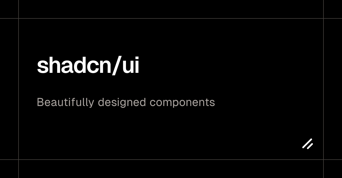
2. shadcn/ui
 shadcn ui react component library
shadcn/ui has exploded in popularity since its 2023 launch, becoming the default choice for Next.js and Tailwind CSS projects. Unlike traditional component libraries, shadcn/ui gives you the source code directly — you copy components into your project and own them completely.
Built on Radix UI primitives, every component is accessible, composable, and styled with Tailwind CSS. The CLI makes adding components effortless (npx shadcn@latest add button), and the growing registry of community blocks and templates accelerates full-page development.
3. Ant Design
 ant design react ui framework
Ant Design (antd) is a comprehensive enterprise-grade React UI framework developed by Alibaba’s Ant Group. With 97,000+ GitHub stars and now at version 6, it offers 60+ meticulously designed components covering everything from basic buttons to complex data tables, tree views, and form builders.
What sets Ant Design apart is its opinionated design system — consistent spacing, typography, and color tokens that make enterprise dashboards look professional without a designer.
4. Mantine
 mantine react component library
Mantine has rapidly grown to 30,000+ GitHub stars by offering the best developer experience of any React component library. With 100+ hooks and 120+ components, it covers an extraordinary range of use cases — from rich text editors and date pickers to notifications, spotlight search, and drag-and-drop.
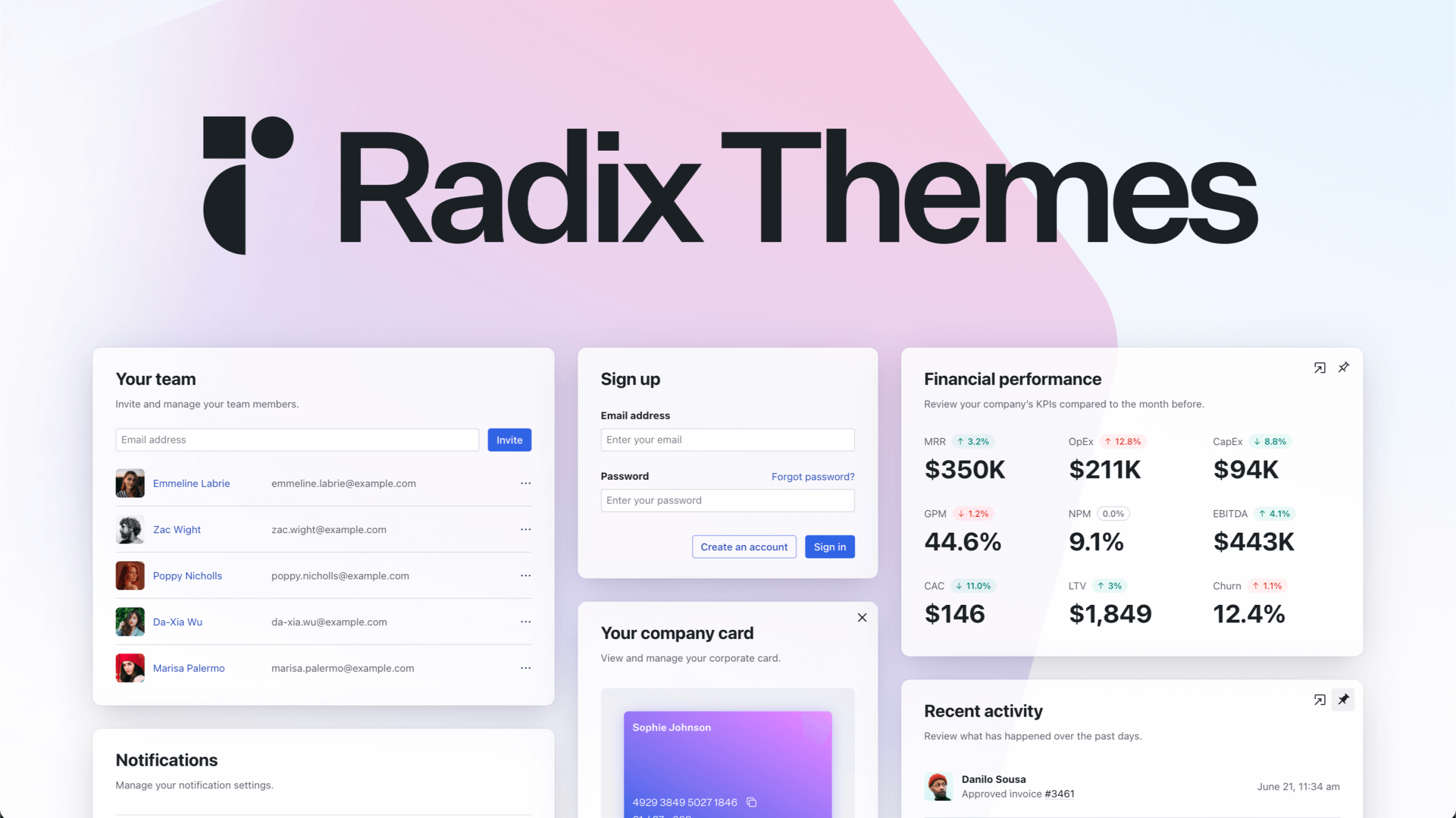
5. Radix UI
 radix ui react primitives
Radix UI provides unstyled, accessible React primitives that serve as the foundation for many popular component libraries — including shadcn/ui. The Primitives package offers 30+ headless components with rock-solid accessibility, keyboard navigation, and focus management built in.
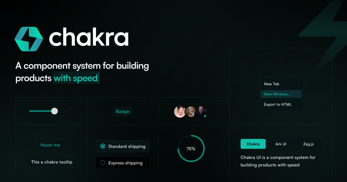
6. Chakra UI
chakra ui react component library
Chakra UI emphasizes developer experience with a prop-based styling API that feels natural to React developers. Instead of switching between JSX and CSS files, you style components inline with semantic props.
7. HeroUI (formerly NextUI)
 heroui nextui react component library
HeroUI (rebranded from NextUI) is a visually stunning React component library built on Tailwind CSS and React Aria. It stands out with smooth Framer Motion animations, beautiful default styles, and a design that feels modern and premium out of the box.
8. Headless UI
 headless ui tailwind labs react components
Headless UI, built by the Tailwind Labs team, provides completely unstyled, accessible UI components designed to pair perfectly with Tailwind CSS. It focuses on the hardest interactive patterns and nails every accessibility detail.
9. Fluent UI
 fluent ui microsoft react components
Fluent UI is Microsoft’s official React component library, powering Microsoft 365, Teams, Azure Portal, and other Microsoft products used by billions of people.
10. PrimeReact
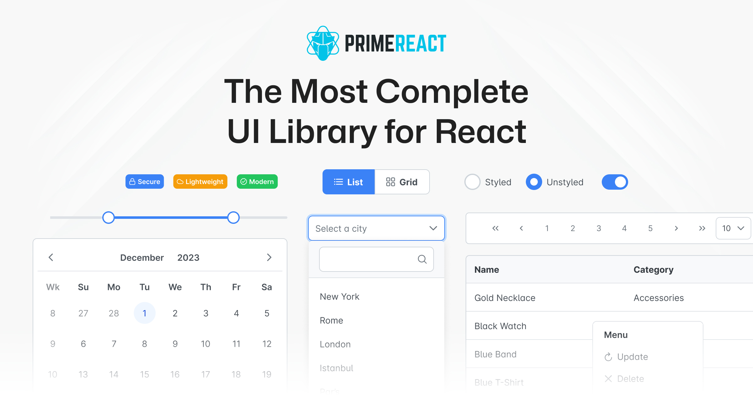 primereact ui component library
PrimeReact boasts the largest component collection of any React UI library — over 90 components covering everything from basic inputs to advanced data tables, charts, org charts, tree tables, and WYSIWYG editors.
11. Tremor
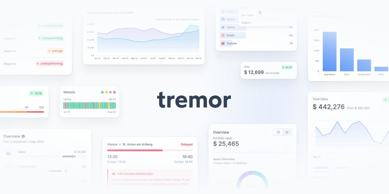 tremor react dashboard components
Tremor is a purpose-built React library for dashboards and analytics interfaces. Unlike general-purpose component libraries, Tremor focuses exclusively on data visualization.
12. React Aria (Adobe)
react aria adobe react spectrum
React Aria is Adobe’s headless component library that takes accessibility more seriously than any other option. For teams where accessibility compliance is non-negotiable, React Aria is the gold standard.
13. Blueprint
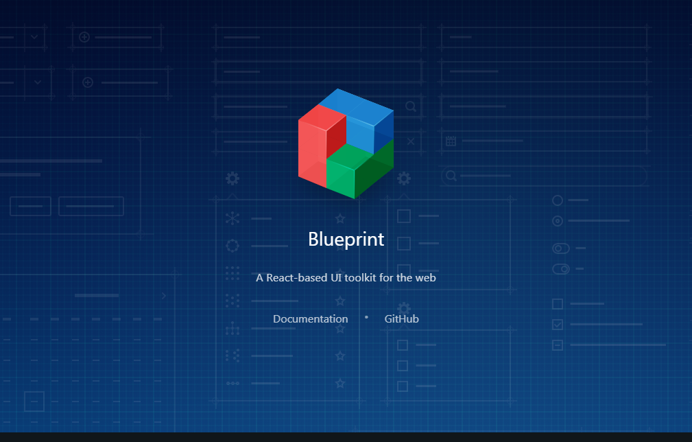 blueprint palantir react ui toolkit
Blueprint by Palantir is a React UI toolkit designed specifically for data-dense desktop web applications. Now at version 6, it excels at building interfaces where users need to process large amounts of information.
14. Park UI
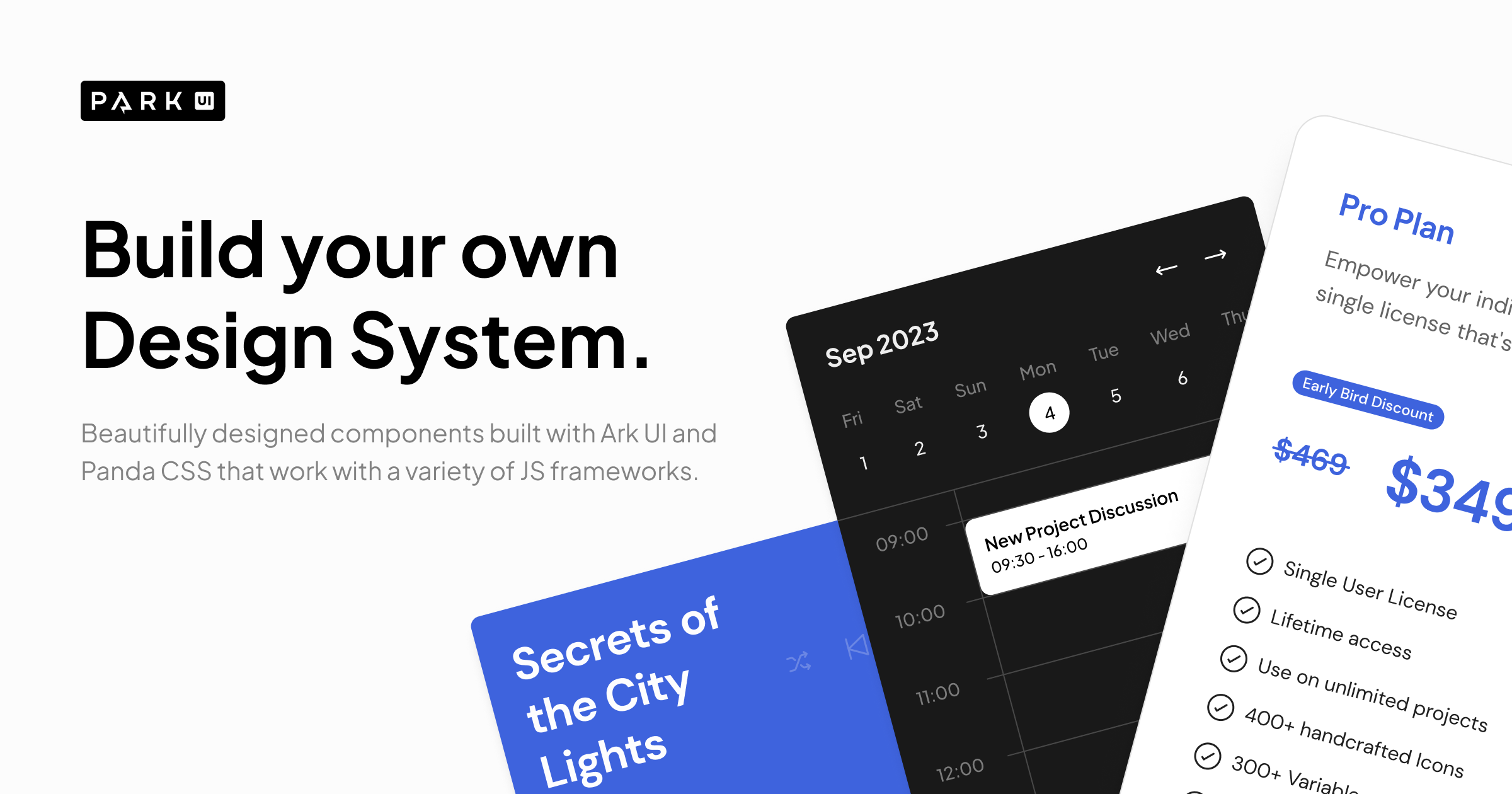 park ui react component library ark ui
Park UI is a newer entrant that combines Ark UI headless primitives with beautifully designed, pre-styled components. It supports React, Solid, and Vue.
15. RSuite
 rsuite react component library
RSuite (React Suite) is an enterprise-grade React component library that offers a comprehensive set of components for management systems and data-heavy applications.
16. Grommet
 grommet react framework accessible components
Grommet, developed by HPE, is a React component library focused on accessibility, modularity, and responsive design. It provides a well-rounded set of components with strong WCAG 2.1 compliance.
Choosing the Right React UI Framework
The best framework depends on your project’s specific needs! All frameworks listed above are actively maintained, have strong TypeScript support, and are free to use in commercial projects. Start with the one that matches your tech stack and design requirements!